Whenever I had to pay rent at my old place, I always found myself a bit frustrated. It wasn’t because paying rent itself is naturally an act of frustration, but because the designers of my rent manager portal decided to use this little navigation thing in the upper right-hand corner, just below the site’s search field:

The dreaded hamburger icon. On desktop.
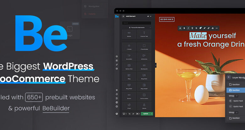
Popular on WordPress, ThemeForest and other template sites, the hamburger, or sandwich, or side drawer, is an icon consisting of three stacked lines that can be clicked to reveal more content, such as the primary navigation.
The use of hamburger icons are detrimental to customer engagement in desktop. We’ve all heard the saying “out of sight, out of mind;” it is a phrase that can be easily applied to web design. By hiding your site’s menu, you are forcing customers to work harder to navigate and presenting a nuance older generations may not be familiar with — mistakes that can cut your customer engagement in half. You are doing the worst possible thing you can make visitors do: think more than they have to.
A less navigable site.
On most websites, primary navigation is an important part of how content is discovered and accessed. By hiding the navigation behind a menu, we’re decreasing the likelihood that the navigation items will be seen or used at all. It also removes visual hierarchy, limiting a visitor’s ability to see where they reside in a site’s layers and causing unnecessary confusion.
Patterns rely on familiarity and emerge slowly over time. The ones we count on today have been around for many years; although floppy disks are cold in their grave, their likeness still represents the “save button” even to younger generations who have probably never laid eyes on one. The three horizontal lines dubbed the “hamburger menu” are quickly becoming a standardized icon on mobile due to the necessity of hidden menus on the small screen. However: on the desktop, users are still confused, as portrayed by its low engagement.
Here are a few things that the hamburger menu can be mistaken for:
- A stack of pancakes
- A very short to-do list
- Cheetos performing a synchronized swim routine
- A tally taken by someone laying down
- Scratch marks from a partially-declawed bear

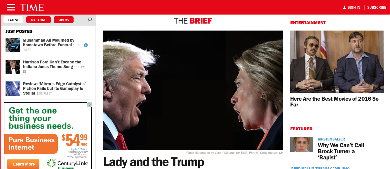
It isn’t a well-enough established icon outside of the context of mobile to depend on to create customer conversions. This doesn’t stop many companies from making an ill-considered attempt: Time Magazine, for example, who is known to have an older readership, hides their entire menu behind a hamburger regardless of screen size. Users have plenty of new things to learn without adding contrived navigation patterns into the mix.
Design appears lazy.
Hiding your navigation under a single button is like shoving a messy room under your bed — it’s lazy and suggests you don’t care about your visitors. While minimalism is a popular design philosophy for creating modern, attractive websites, it doesn’t necessarily mean less content; you can successfully deploy minimalism without removing important information. To achieve minimalist design, manage perceived complexity by adding more white space to the interface and reducing the contrast between elements to make the whole layout visually quieter while keeping all of the necessary information easily accessible.

On Snowbird’s website, they successfully manage a large amount of content with a minimalist design.
In addition to appearing sleek, many websites have jumped on the hamburger-wagon because it doesn’t require a separate approach for different screen sizes. Companies like Time, The Atlantic, Fastcompany, Upworthyand Slate seem to be in agreement.
“We knew that people are coming into the site through desktop at one point and mobile at another,” says VP of Tech at Slate, Dan Check. “We wanted to make sure that there was some sort of consistent navigation experience between the two.”
While there are many in argument for the “mobile first” design approach, it is the job of a designer to provide an optimal experience for the available screen size and not hobble themselves by slavishly following this philosophy — if we ignore that the size of the screen has changed, we risk problems such as higher friction navigation and an overabundance of white space creating an unbalanced layout. There are ways to foster consistency without forcing everything to conform to a phone-sized viewport, such as color palette, spacing, hierarchy and content placement. Designing a site so that it feels the same across devices is much more important than whether it looks exactly the same — in a world of unlimited devices and screen sizes, we no longer have the luxury of making things pixel-perfect and identical; we can be certain they won’t be.
So, what about mobile?
On a larger screen, such as an iPad or desktop, there’s more room to reveal the important tasks that users want to complete on a website, but in the case of a phone there’s the issue of limited real estate, so compromises on discoverability of content become necessary. While the hamburger succeeds at its purpose when navigation becomes too overwhelming for the allotted screen size, you may consider laying out your full menu when the site’s navigation is simple — even on mobile. The challenges of small screens are an opportunity to consider winnowing your navigation to fewer, higher priority choices than can be easily presented instead of a longer, less focused menu.
Conclusion
Don’t let the hamburger menu be your life vest for a bad content strategy — if your navigation is really so substantial that you have to hide it, then leaving it to your visitors to do the heavy lifting is going to backfire. While hamburger menus are useful when you are faced with fitting a large navigation on a small screen, they should generally be avoided on desktop. Your most important wayfinding information should not be hidden clicks deep — your visitors should always be easily able to determine at a glance where they are in the hierarchy of your website and how to get where they’re going next.


Hi mira,
Great content. I passed your link on to some others.
Totally agree.