Mobile is the dominant computing platform of this generation, but plenty of people still discover and download apps from traditional websites.
Since the launch of the app store, we’ve seen countless posts on the topic of landing page inspiration and optimization that commonly tout the obvious: showcase a benefit; establish a clear call to action; place a download button above the fold, etc.
In 2015, these patterns have solidified and continued to evolve. See some of the best designed app landing pages of the year below.
Operator(Single Non-Scrolling Page)
Operator is the best example of 2015’s big shift to non-scrolling landing pages.
It’s extremely difficult to introduce an app, articulate its value, and offer it for download on a single page while maintaining visual clarity. Operator does an incredible job of all three, with room to spare for header and footer links. A friendly emoji even welcomes visitors to the app’s waiting list.
Mylo(App Preview)
Previewing an app’s capabilities is an important feature of today’s landing pages, many of which integrate demonstration videos. Mylo has done the best job this year, implementing an auto-play feature along with a narrator (defaulted to mute), which clearly details the app’s value.
Following the splash, Mylo introduces visitors to its app, brand, and values with fashionable fullscreen photography, highlighting the company’s philosophy of simple living.
Swifty(Live App Demo)
Swifty takes in-app demonstrations to another level this year with a live demo that encourages users to test the app on their landing page.
If you interact with the demo, you receive your first one minute lesson, followed by another trend that has emerged this year: the replacement of “Download on the App Store” with “Get the App”, mirroring the App Store’s recent shift in language.
Facebook Moments(Video)
Explainer videos are nothing new on landing pages, but the production value of the Moments video, and its completely seamless integration into the browser, certainly is.
The player is completely embedded into the browser, and the video’s first screen matches the landing page, which enables the Moments site to transition seamlessly from browser to video. The video is clear, well animated, and unique, explaining the value of the app while barely showcasing it.
Facebook Messenger(Cross Platform)
Increasingly, mobile apps are becoming more than just mobile apps: they’re becoming single pieces of a cross-platform strategy that encourages users to connect on any device with transferable data and a consistent experience.
In addition to showcasing their ubiquity across phones, Messenger includes a laptop view of the app in the background, making it clear that Messenger is a cross-platform app that can be used anywhere. Add an integration that retains your Facebook login and greets you by name rather than asking you to Sign In (not pictured above) and you’ve got a messaging app that feels like it will follow you anywhere.
Trippeo(Rich Media)
With their compelling single page narrative following a users app experience, Trippeo is 2015’s best landing page for interactive design, rich media integration, and digital advertising.
The site is well realized with a smooth, animated flow, a subtle (but effective) use of video, and a clear value proposition told through a simple story. It’s questionable, however, if sites like this convert. Either way, it’s a pleasure to browse through.
Kong
Kong’s page ignores conventional landing page wisdom (especially for apps), but still manages to create a compelling, albeit mysterious splash that encourages visitors to explore the app in depth.
Periscope
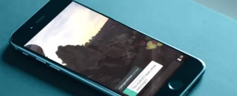
Periscope’s user experience focuses almost exclusively on its live-view screen, and this is demonstrated perfectly on their landing page. From the video of the hot air balloons to the tagline: “Explore the World Through Someone Else’s Eyes”, the value of the app is easy to understand and definitely encourages a download.
Stripe
Stripe does an excellent job of building trust with potential customers through a few subtle touches: a cleanly animated walk-through; the use of tablets and phones to demonstrate app capabilities; and a trustworthy blue palette that suggests your finances and personal information will be handled carefully.
Black
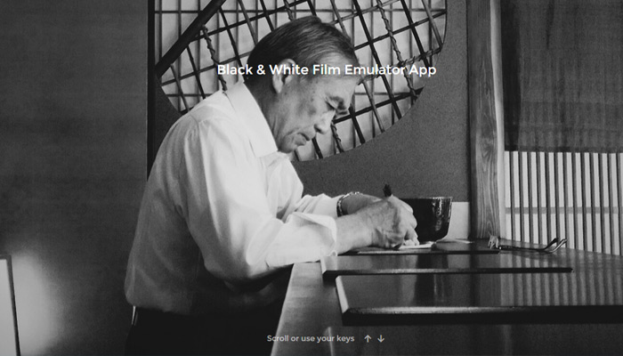
What else would you expect from a film emulator app? Giant, striking photography, black and white imagery, and contemporary web design position Black as the artsy alternative to Instagram and a throng of other photo filter apps on the market.
NeuBible
NeuBible has all of the bases covered: a striking hero shot, clear messaging, and a prominent download button. Combined with a gorgeously realized app, these three features may help NeuBible convert the masses.
Filters
A large, eye-catching icon gets prime real estate on Filters’ landing page, a clear indicator that the visitor is perusing an application page. The splash also features a subtle mosaic of Filters’ capabilities. Everything one needs to know about the app is communicated in a single page and a single sentence.
Todoist
Todoist is a cross-platform application, which means things can get complicated. Fortunately, this well-constructed landing page frames Todoist with a clear value proposition and some clever button copy. Visitors can take a dive deep if they like – the features of each platform are neatly organized with a series of buttons along the footer of the splash.
Faces
Faces makes use of some simple but effective scrolling techniques to compliment its clear and concise copy. Users scroll through a three step application demo while sampling a few of Faces’ caricature options. As effortless as an demo gets!
GameIt

GameIt is a fun landing page with a splashy aesthetic and smooth flash animation. Visitors scroll through a series of app screen demos that might feel like an information overload in lesser hands. However, GameIt’s smooth animation and sharp copy are easily digested.
Qapital
Qapital is notable in that it takes a visual approach to a market that is usually appealed to with practical messaging and conservative imagery. Large images dominate the splash page to reflect the app’s interface. Qapital does an excellent job making finance feel exciting: a very tall task.
Docady
In tandem with a full page splash video, a prominent preview button does the heavy lifting on Docady’s landing page. A wonderfully animated app preview is also put to good use. Simplicity may not be their forte, but Docady has a host of bells and whistles at their disposal.
Rizon
Rizon is an exercise in clean design and clear messaging. In a nice touch, Rizon’s logo mirrors the app’s main screen, which lets the user know what hour the best photos are taken (“The Golden Hour”). Visitors are prompted to sign up through a centrally located button and a straightforward preview of the application.
Peeq
Prefer not to read? Peeq’s landing page is for you. A 6 second visit is all you need to understand Peeq’s 6 second approach to social media. Enough said?
Urban Walks
Urban Walks is billed as “A Better Way to Explore NYC.” If that’s not true, it’s a pity, because their landing page is a master class in rich media. Visitors are encouraged to scroll through a host of Urban Walk’s functions, and I encourage you to do so, whether you’re planning to visit NYC or not.
QuizUp
QuizUp, the successful trivia game turned social media app, has a single page experience that makes use of 3D imagery, concise messaging and clearly labelled buttons. QuizUp is a confidently designed page that places their app demo and CTA front and center.
Did I miss any great landing pages? Feel free to share in the post comments below.
Author Bio: Daniel Eckler is the founder of Mylo, the simplest way for men to dress well. You can find him on Twitter @mylo_daniel or read more about him on his personal website.


Nice list here Daniel. Please check out http://www.brigge.co and let us know what you think. You can contact us from link in the site.
Great list Daniel. I personally love QuizUp. Landing page works as gateway. If it looks great. It will get visitors converted into users. Thanks for the article.
Daniel great list! Any updated list for this year?