Apple was the first major company to introduce standard retina screens on many devices. The newer MacBook Pro computers have been launched with a retina monitor, along with most iOS devices. This means a larger consumer market is growing and designers have to keep up with the changes.
In this guide I want to share ideas about retina displays and their purpose. Building a native application for Android or iOS is much simpler than a retina-ready website. It will take a bit of practice if retina design is unfamiliar to you. But it’s worth the effort when your final product comes out looking spectacular on all monitor resolutions.
The Basics of Retina
When you think about screen density the units attempt to compare digital pixels with physical inches. PPI(Pixels Per Inch) is the common unit of measurement and it changes for each device. Regular density screens have a certain number of pixels found in a 1×1 inch block.
This amount would double in a retina display. Apple packs a double-dense number of digital pixels into the same physical screen. The technology is supposed to be dense enough that a human eye couldn’t tell where the individual pixels appear.
You can see this in a lot of modern designs along with iPhone device mockups where the PSD files are double the size to fit this higher resolution.
Scalable page objects like text, CSS containers, and SVG graphics can naturally adapt to this double(and sometimes triple) resolution.
Bitmap images and fixed-width objects tend to remain stationary while trying to spread out the pixels more evenly. The goal of designing for retina is to create most of your website using flexible content. Images should be SVG when possible, or you can provide duplicate images for both resolutions.
Take a peek at this retina-focused article published on Smashing Magazine. It goes into more depth about the design techniques and how you might code an HTML/CSS website for natural adaptation. I’m more interested in the techniques you can use right now to update any current websites. You could also start practicing these methods in newer projects as time goes by.
Replacing Icons with Fonts
Some designers who are familiar with CSS3 will know about custom fonts. You can include a local or remote link to font files, and this becomes a new family accessible within CSS. Aside from letters and numbers you can include icon-based fonts as well.
This can work much better than making vector icons, or creating a double set for each image. Font icons will naturally scale up based on the screen size. Using percents or ems for units will ensure the font stays at an appropriate size for the monitor resolution. And you can write the icons into your HTML code without needing to reference an HTTP request to an image file.
The largest drawback is getting icons which look shiny, colorful, and utilize detailed graphic styles. Most icons will display just like a font, using one color and maybe some text effects. If this can work for parts of your website I’d highly recommend it. Otherwise you may need to split the difference using some real images along with some fonts.
If you’re looking for a nice font collection, start out browsing the directory We Love Icon Fonts. Many designers will host their files on Github but they won’t always appear in Google searches. You can use this tool for locating new icon fonts to include for your own projects.
Scalable Vector Graphics
Vectors are commonly built for logos and icons that need to scale for different resolutions. But these graphics don’t have support for displaying naturally in a web browser – until SVG was recently pushed through with tremendous support. These are simple vector graphics which define points of data in a key-value syntax.
The graphics themselves include data about how to display colors, curves, line segments, shadows, and other typical features. Older web browsers can’t support these graphics when the page renders, but you can include a script like SVGeezy to handle fallback methods.
Sitting down to design a full graphic will take some reading and most likely a vector design suite. If you’re not a skilled designer then try checking Google for open source freebies to download and play with. I would also very much recommend this primer to hacking SVGs for web developers.
CSS3 Retina BG Images
The two most common solutions for handling retina replacement graphics are through CSS3 media queries or JavaScript libraries. CSS3 is less supported in older browsers, while JavaScript can still be disabled by anyone. Either can work fine it just depends on your purpose and how you generally code websites.
Replacing the images with CSS3 follows the premise of media queries to check when a user is on a retina screen. Then we can replace the image through a background URL setting, which only displays for the retina user. Check out the code below found in this Sitepoint article.
#myimage {
  width: 400px;
  height: 300px;
  background: url('lo-res.jpg') 0 0 no-repeat;
}

@media
screen and (-webkit-min-device-pixel-ratio: 1.5),
screen and (-moz-min-device-pixel-ratio: 1.5),
screen and (min-device-pixel-ratio: 1.5) {
  #myimage {
    background-image: url('hi-res.jpg');
  }
}
Checking each screen device for the min-device-pixel-ratio value will always return something. Modern browsers supporting CSS3 will typically react quickly and it seems almost instantaneous to the visitor. And you will definitely want to take a peek at this article on vendor prefixes which states an opposing property name for min–moz-device-pixel-ratio in Mozilla Gecko browsers.
Media queries today are built around the newer CSS3 specifications. It’s very popular but still gaining traction among newer designers who haven’t tried out these techniques. Just keep yourself practicing and search through Stack Overflow whenever you run into code problems.
JavaScript Implementation
Not all browsers can support CSS3 effects, although most browsers on a retina display certainly would. But in any case I still recommend JavaScript solutions where appropriate. Smartphones and tablets come with JS support enabled by default.
I’d like to share two libraries which are definitely worth checking out. The first is called Foresight.js which detects if a device has the retina display or not. Then it will automatically pull the correct image based on your settings. Take a peek at some live demos along with source code examples.
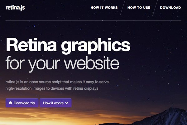
The other library I’ve come to enjoy is Retina.js. It’s an open source jQuery plugin which performs many of the same tasks as Foresight. It will determine if the user’s display has retina properties or not, and then replace regular images with the @2x counterpart. It will only pull if there is a replica on the server, otherwise it leaves everything alone. A very small script and pretty simple to work with.
Further Reading
- Why should you become retina ready?
- Creating Retina Images for Your Website
- Implementing Retina-Ready Images on the Web
- Amazing Selections and Examples of Retina Ready Websites
- Retina HiDPI and your Webapp
Closing
I hope these tips can get you started on the path to building flexible retina-ready website layouts. Planning a design is the first step and using this knowledge can really expedite the process. How will the site look in a responsive style? It’s wise to plan out which techniques you need(if any) to handle average retina displays. If you have any questions or related suggestions feel free to share in the post discussion area.


FYI: The Foresight Github page says that this solution is now outdated and deprecated.