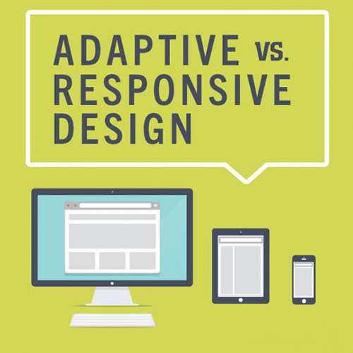
What’s the difference?
Responsive is fluid and adapts to the size of the screen no matter what the target device. Responsive uses CSS media queries to change styles based on the target device. This “fluid grid” resizes the page width and/or height to adapt to different screen sizes and show correctly.
Adaptive design uses several distinct layouts for multiple screen sizes, and the layout used depends on the screen size used. Adaptive works to detect the screen size and load the appropriate layout for it.
How do responsive and adaptive compare?
Adaptive designs are less flexible, only working on as many screens as its layouts enable. If a new device with a new screen size is released, you may have to edit your design or add a new one. Responsive sites are flexible enough to keep working on their own, but Adaptive sites will likely need some occasional maintenance.
Should I use responsive or adaptive design?
Responsive is the safer option to go with for your site in most cases. It functions well regardless of screen size, improves loading times and is usually well worth the extra initial design time.
