We all know that flat design is all the rage right now, and for good reason.
Almost every major company that has done a logo redesign in the past two years has gone for a completely minimalist and simple design.
Nissan is no exception.
http://https://www.youtube.com/watch?v=7LgdE4j_XJw&feature=emb_title
Nissan’s New Logo Design 2020
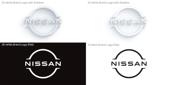
After nearly 20 years, Nissan has gone through its first redesign glow-up and we are loving it.
It all started in 2017…
The Nissan redesign process all began back in the summer of 2017.
Nissan’s Senior Vice President of Global Design, Alfonso Albaisa, started looking at the logo and decided it needed a good freshening-up.
The design team at Nissan took this time to decide how they were going to redesign the logo.
They thought of everything from a complete and total revamping of the logo, or just a simplified version that is sleek and modern and fits every occasion.
This new simplified version of Nissan’s logo still holds fast to its original logo roots but fits better in our modern world than the anterior logo.

This is their first logo redesign in 20 years, which to me is just mind-boggling.
And the first sign we got that they were under redesign was back in March of 2020 when they applied for some trademarks.
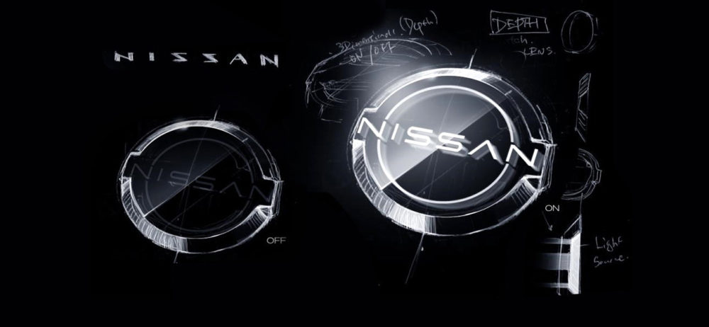
The 3 words that Alfonso and Tsutomu Matsuo(Nissan’s design department deputy general manager) used to describe the new logo for Nissan were “thin, light and flexible”.
And the new logo is nothing short of that.
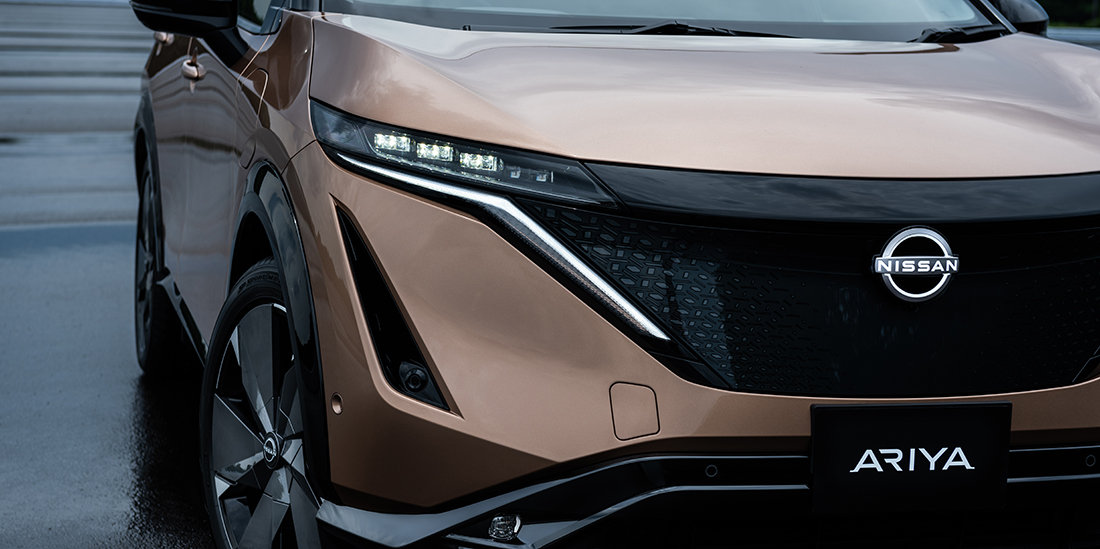
This new logo needed to be sleek and minimal, but they also wanted it to glow.
In an era where people are leaning towards getting electric cars, this new logo needed to stand out and match the style of a new and modern electric car.
In order for this logo to look good across all digital platforms and also in real life on cars, the design team needed to decide on an appropriate thickness that would always be visible.
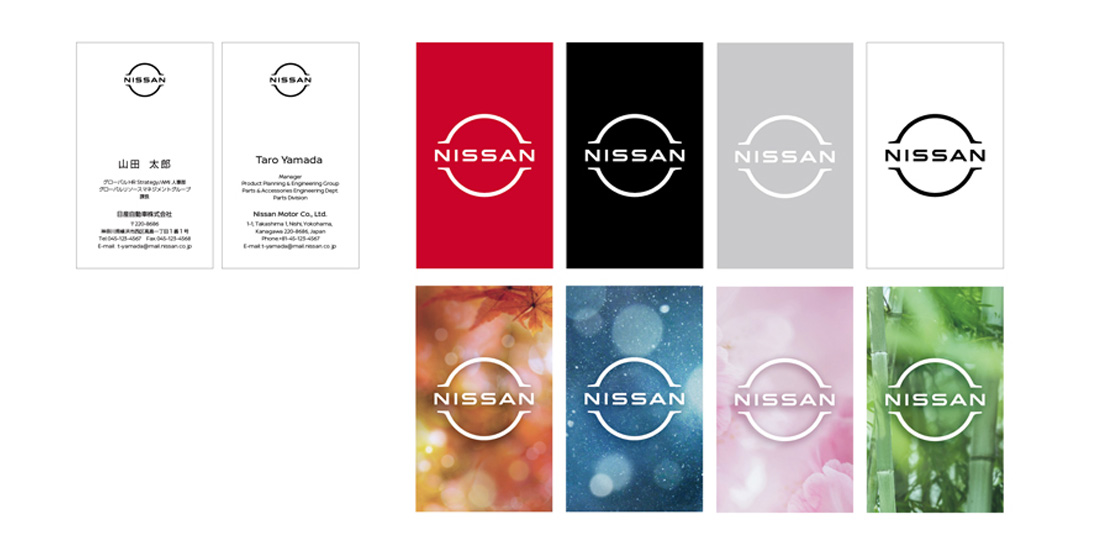
Like I said, Nissan really held onto the heritage of the original logo and the slogan they work by, which states “If you have a strong belief, it penetrates even the sun.”
You can see this implemented through the fundamental elements in the logo, which are the circle and the horizontal plate of the name.
So while the new design isn’t completely revamped, it definitely looks a lot better and newer.
It looks amazing across all platforms and also when it’s displayed on the car.
We are huge fans of Nissan’s new logo design.
In Conclusion
2020 has been the year that lots of car companies have redesigned their logos.
First, we saw BMW come in full force with a gorgeous, minimalistic logo redesign. Secondly, we saw VW hit us with a new sleek design, and now Nissan.
Who do you think will grace us next with a new logo design?
What do you think of Nissan’s new logo? Are you for it or would you have done things differently?
Let us know in the comment section down below.
Until next time,
Stay creative!



Leave a Reply