There’s no clear-cut scientific formula to great design because it’s undoubtedly considered more of an art than a science. Strangely there are many recognizable patterns which seem to reappear time and again. These might be called popular design techniques but from an industry perspective many people refer to them as design trends.
This post delves into the most fascinating design trends gaining recognition by modern web designers. Although trends are often created by people who are willing to push boundaries, all trends have a direct effect on the design industry as a whole. New designers and developers can learn a lot by crafting websites around these trends – but no matter what your skill level there’s always something to learn by studying the most favored qualities of website layouts.
Ghost Buttons
One of the fastest growing trends in web design is the ghost button. This style follows in the footsteps of flat UI design where buttons use a single color background with a seemingly 2-dimensional appearance.
Ghost buttons are designed to be empty or semi-transparent by default. They light up on hover which adds some color and distinctive notoriety to the design style. If you look at ghost buttons found in websites they often look like boxes with colorful borders. Designers create the “button” look by rounding corners and using extra padding around the text.
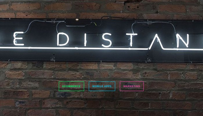
One such example can be found on The Distance creative agency. Their header design actually works around three ghost buttons each using a different color scheme. Properties like color and font size can be used to draw more attention towards particular buttons on the page.
But contrast is another way to build a distinguishing look between buttons. Take a peek at the homepage design for Sketch by Bohemian Coding. The header uses a ghost button next to a regular flat button design.
The ghost button leads to a free trial download of Sketch while the colorful flat button is for purchasing the software. Since the ghost button seems “empty” it generally falls into the background, forcing visitors to notice the purchase button more clearly.
Ghost buttons are perfect for flat or minimalist layouts and they can be used in combination with many other design techniques for creating brilliant websites.
Feature List Icons
Startups, mobile apps, and creative agencies like to use graphics and blocks of text to outline their features. Most of the time you’ll find these features on the homepage in a list of pithy sentences coupled with small icons.
To my knowledge this trend has no official name but I’ve coined the moniker feature lists. These are text-based lists which often rely on icons to help describe the features being listed.
Features could include the services provided by a startup or the characteristics of a piece of software. This trend has become very popular and it’s been adopted by hundreds of various websites.
Life360 is a mobile app for collecting photos and life memories. Their landing page design is well organized and uses a pristine collection of features with icons.
Towards the bottom of the page you’ll notice some features that are broken up into horizontal rows. Each row starts with a small heading and lists three features alongside each other. The features also use icons to convey a visual meaning.
This is the traditional use of feature lists but there are deviations.
Take a look at the Silverpush homepage which uses a somewhat expanded version of this technique. The icons are paired with sentences covering a quick how-to process for using the product.
Feature lists don’t always need to list features, but could alternatively go in-depth about how to perform certain actions. This is great for explaining how a customer would go from purchasing your service to the final outcome. I encourage designers to build on top of this trend and find new uses for icons and snippets of featured content for explanatory purposes.
Galleries & Slideshows
Modern websites can run pristine dynamic galleries and media slideshows on any screen size. Mobile smartphone browsers have come a long way combined with responsive design techniques.
It’s possible for a new web designer to pick up a simple responsive carousel plugin and code it right into any layout with ease. Code libraries are released for free and open source plugins come with fantastic documentation. jQuery makes frontend development even easier and this trend has skyrocketed into stardom over the last few years.
The fullscreen slideshow found on the London design agency Tokyo is stunning. Each slide represents a case study from client work and uses a fullscreen background photo relative to the project. The homepage feels clean, smooth, and very easy to use.
This is the foundation of any unique image gallery or slideshow. Digital media has become so commonplace that visitors practically expect it on every website. As the designer it’s your job to figure out the best method(s) for adding media into the page which can also be easy to use.
For the time being it appears that jQuery is the quickest and most efficient way to create galleries. You just need some images and a bit of time to play with the setup. As trends advance I expect to see more animation and other techniques built into media galleries for the web.
Dynamic Storytelling
Parallax design is most certainly a well-respected trend. Designers have fallen in love with parallax websites for the creativity and the beautiful presentation. Developers also love to release free parallax plugins which feed into a cycle of growth.
By digging deeper into parallax design you’ll find another trend: the art of dynamic storytelling.
Almost every website has a story to tell – but content isn’t always laid out in this fashion. Parallax layouts feel more natural for storytelling because they mostly rely on a single page. Graphics, text, animations, and page sections are accessible without ever reloading.
The Movement of Data website is a perfect example. This parallax layout scrolls both vertically & horizontally using motion as a visual cue for storytelling. It’s a way to advance the website’s content while also maintaining interest through visuals. Many parallax layouts follow this same technique for motion and dynamic effects.
But also keep in mind that successful storytelling requires great content. Parallax layouts make content consumption easier because it’s found in sections and is accessible from a single page.
The best parallax designers will learn how to combine graphics, animation, and content design into one amalgamation of website ingenuity. Parallax design isn’t the only choice, but it tends to be the easiest. Whether you’re creating a parallax site or a multi-page site try to incorporate design with storytelling to draw fascination for the website’s content.
Fixed Sliding Navbar
Although fixed headers have been around for years the trend has recently advanced quite a bit. The vast majority of designers have taken a liking to fixed navigation bars which stay on top of the screen at all times.
One of the most common techniques is to blend the navigation into the header while at the very top of the site. When a visitor first lands on the page all navigation links appear as though they’re just part of the header section. But as the visitor scrolls down this navigation becomes fixed in a small bar at the top of the screen.
Invision App demonstrates this technique live on their website. The header section uses a dark video background where the links blend seamlessly. But as you scroll down these navigation links and the logo become fixed in a top white navbar.
Some designers like this effect while others complain that it takes up precious space on the screen. I think it works great when used on the right type of website. Visitors often appreciate being able to access navigation from anywhere on the page, so long as it doesn’t completely take over content.
Designers also like to add neat effects to these sliding navbars. Themes Kingdom actually shrinks their logo and navigation links when scrolling down the page. The very top header section offers more room so the text can spread out a little more. But while moving down the page it’s more valuable to sacrifice link size for more screen real estate.
The use of a small animated effect can really spice up this trend. If you’re designing a website with one of these fixed navbars consider applying a small animation or slidedown effect while scrolling.
Grid-Based Layouts
It’s tough to say exactly when the grid design style became popular but it is definitely a beloved choice by many designers. Grids have always played a role in web design but they haven’t always been clearly obvious in the final product.
Typically grid-based designs work well on sites that need large content lists. Webpages like social media feeds, online magazines, or photo galleries can all benefit. This trend of grid-centric layout design actualizes the concept of wireframe boxes into a full website design.
24ways is a stupendous design magazine which has been online for years. Their design has changed many times and the most recent iteration relies on grids for post listings. Their homepage and archive pages all list content in a fixed and rigid structure of boxes.
The thing I love most about grid design is the flexibility. Responsive layouts are very trendy and grid-based design makes it so much easier to create naturally responsive websites. 24ways is fully responsive and you can see their mobile design by resizing your browser window.
I also really enjoy the Pinterest board layout which relies on grids as well. Pinterest is a little different because the grid boxes aren’t lined up perfectly, but instead fall into a seemingly disorganized pattern. In this case asymmetry works great and has become somewhat of a calling card for Pinterest’s website design.
There are dozens of tools and free resources for designers who want to try building grid-based websites. For example, frontend developers may dig into free CSS grid libraries which can be found all over the web. Those who are interested in JavaScript may alternatively try out jQuery Masonry which is a plugin mimicking Pinterest’s grid design.
Custom CSS3 Animation
Ever since the CSS3 specification was released developers have been hurling themselves onto the bandwagon of CSS animation. Web browsers are now more advanced to support CSS3 transitions and keyframes en masse. It’s only natural that as browser support increases there will be more developers getting their hands dirty.
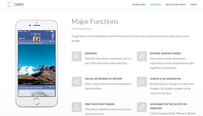
One of my favorite modern effects is the scrolling page element animation. When a visitor scrolls down the page elements will fade-in or slide into view from offscreen. Carde app uses this effect on their landing page.
Traditionally speaking, this effect does require a very small amount of JavaScript to handle the CSS classes. But all of the animations can be controlled 100% via CSS which only runs when the element(s) come into view. I actually wrote a brief tutorial detailing how you can recreate this effect for any website.
Another exciting but less-common approach to CSS animation is the use of SVG graphics. These stand for Scalable Vector Graphics which are typically created in a program like Adobe Illustrator. SVGs can be scaled dynamically and CSS3 is the perfect compliment now that modern web browsers can support both.
Take a look at the Bjango navigation bar and try hovering over some links. You’ll notice each one has a default and hover state which relies on SVG images. But the hover animation uses an elastic bounce effect which is applied to the SVGs through CSS3.
Admittedly this can be a tricky concept for new developers to grasp. But it shows how much CSS3 has advanced in just a few short years. As frontend web development trundles forward I’m excited to see what the future has in store for web animation.
Final Thoughts
Many new design trends continue to emerge with each passing year. I certainly hope the trends above can light a spark in designers both new and seasoned to the field. Web design is now more in demand than ever before, and a good designer should be able to deliver based on current trends and best practices. By studying what’s hip you’ll learn how to craft websites based on the needs of your clients and the needs of the design industry as a whole.


I agree for ghost buttons, grid based layouts and css3 animations, but according to me feature list icons are starting to feel like old school
These are great, I am glad I am not surprised my what is trending! Thanks for the share. Now I can back up my reasoning when I choose ghost buttons. 🙂
Ghost buttons with CSS3 transitions and seemingly disorganised grids are massive at the moment. Great post with good examples!
Ghost buttons and grid based layouts are now really popular. We can expect few more cool design trends in coming days. 🙂
Great samples of the latest design trends. Thank you for sharing. Ghost buttons and css transition are our favourites 🙂
Yes, it is true. Ghost buttons are the imperative and the swiftest chunk of the web designing trends.
thanks for sharing the contemporary web design trends with us. Today, in this hard-hitting ambiance, many firms are granting the valuable web design services. One of them is http://www.technocrab.co.uk/web-design-birmingham.html
Great article. Ghost Buttons and Interactive Storytelling are the best among these. Would like to share few more –
1. Card Design
2. Micro-interactions
3. Parallax Scrolling
Manager
http://www.pixelcrayons.com
Nice read.
Ghost buttons and bigger background images are best from the above list. Would like to add few more –
1. Micro-interactions
2. Parallax Scrolling
3. Card Design
This is excellent information. It is amazing and wonderful to visit your site. It really gives me an insight on this topic.
Web Design Jaipur
Thanks for sharing, Jake. Good design is a very important part of successful website. I am thinking over creating my own site, and it is very hard to chose quality tools and services for it among the great deal of suggested templates, icons, buttons, etc . I tend to templatemonster.com , seems to be the best on the market.
It looks that some trends date back to 2013 but they are more complicated and advanced now. Such as dynamic storytelling seems to be just parallax scrolling gone mad 🙂
Try using bloxup.com I did and it worked out pretty well for me.
Thanks for collecting the different trends, helped give me some ideas as I work on a large site redesign.