This last year marked a huge leap in web design, with the dominance of mobile browsing and the increase in HD devices.
Everything from typography to layouts has been restyled to suit the tastes and expectations of modern users, and the best practices of even just a few years ago can nowadays make a site look old or outdated.
For visuals, this year we saw more hero image — single images that cover the entire background. This enlarged visual, often an expressive photograph, draws the user into the site almost immediately, making it a popular choice for home and landing pages (like Twitter).
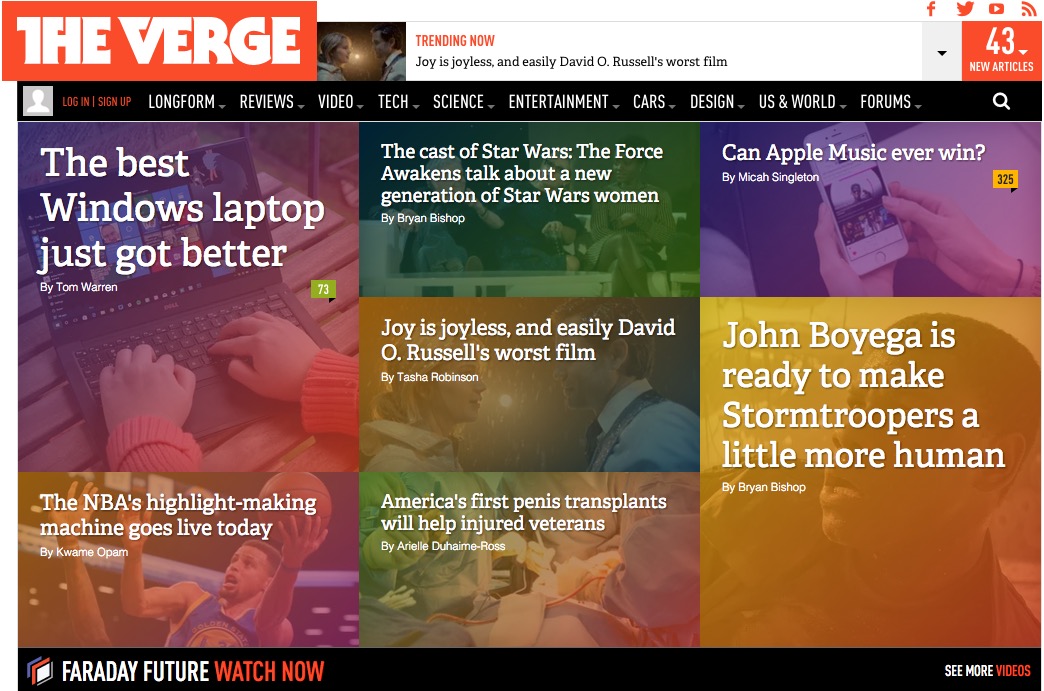
The increase in mobile traffic also opened the door for many new trends. Long scrolling, for example, suits the natural restrictions of mobile like screen size and difficulty loading new pages. The card UI pattern, as well, suits mobile, with a flexible organization that can be rearranged for different screens (like The Verge).
These are just a few of the design trends discussed in UXPin’s free guide Web Design Book of Trends 2015 & 2016.
This 186-page guide explains the 10 most effective design trends of last year — why they’re popular and the best practices for applying them, with 166 hand-picked examples from companies like Adidas, Dropbox, Apple, BMW, Spotify, Google, and more.
What trends did you notice this year? Check out the free e-book and let us know your thoughts below.
[sdfile url=”http://studio.uxpin.com/ebooks/web-ui-design-trends-2015-2016/” title=”If you would like your free e-book please provide your name and email, and a link to the files will be sent to you shortly.”]


It will be interesting to see how long Hero image trend lasts. For sure they create a good first impression but I don’t see the trend lasting simply because so many sites are now using them.
I do like the card UI pattern in your example. Now that’s a trend I do see lasting for some time.